Student to-do configuration
How I reduced time spent with customer support by 42%
Project overview
This project was the largest I worked on during my time at an education software company where our app was focused on supporting college and career readiness. One of our core features was a module where district administrators could configure to-do items for students and staff. This feature was incredibly important in that these to-do items instructed what students and staff do on our platform, and this is how districts customized our tool according to their own needs.
The biggest challenge with this feature was that there were SO many possible to-do items students could be assigned, and each one needed to have details configured individually. To-dos were something that needed to be configured as each district was onboarded, and they often required support from our customer success team given how complicated the feature is and how un-intuitively it was initially built. With this project, my objective was to redesign this feature in an intuitive way that would allow district users to configure to-dos without customer support!
Role
As a lead designer, I worked along side a product manager and the CTO on this project. I also played a large part in defining project goals with the product manager.
Duration
I worked on this feature for about 12 months from ideation to hand off.
Scope and constraints
This was a complete redesign of one of our most complicated, but core, features. The only constraint I had for this project was our design system.
Project goals
The main goals of this project were to…
Make it easy for district administrators to set up to-dos, reducing the need for time spent with customer support
Allow for greater configuration flexibility, enabling districts to set up to-dos in different ways according to their school’s goals and student’s diverse needs.
Introduce a way for staff to easily compare which to-dos each student group has assigned, ensuring students are supported in meeting their goals and none are overlooked.
Business goals
Given that to-dos define how staff and students are instructed to use our platform, this feature plays an important role in differentiating us from our competitors. A seamless onboarding process, intuitive user experience, broad range of functionality, as well as unique comparative and analysis tools within this feature all lay the foundation for making our tool one that is above all others in the market.
Design process
My design process typically involves several key stages tailored to the project's scope, requirements, and budget. I begin with research to gather insights, after which I transition to ideating through iterative low-fidelity designs. These initial concepts are then reviewed collaboratively with the design team and project manager to ensure alignment on project goals. Upon approval, I move on to develop high-fidelity screens and user task flows, which are then tested. Typically, user tests will call for at least a few revisions. Once the design is finalized, it is meticulously documented and handed off to developers for final implementation.
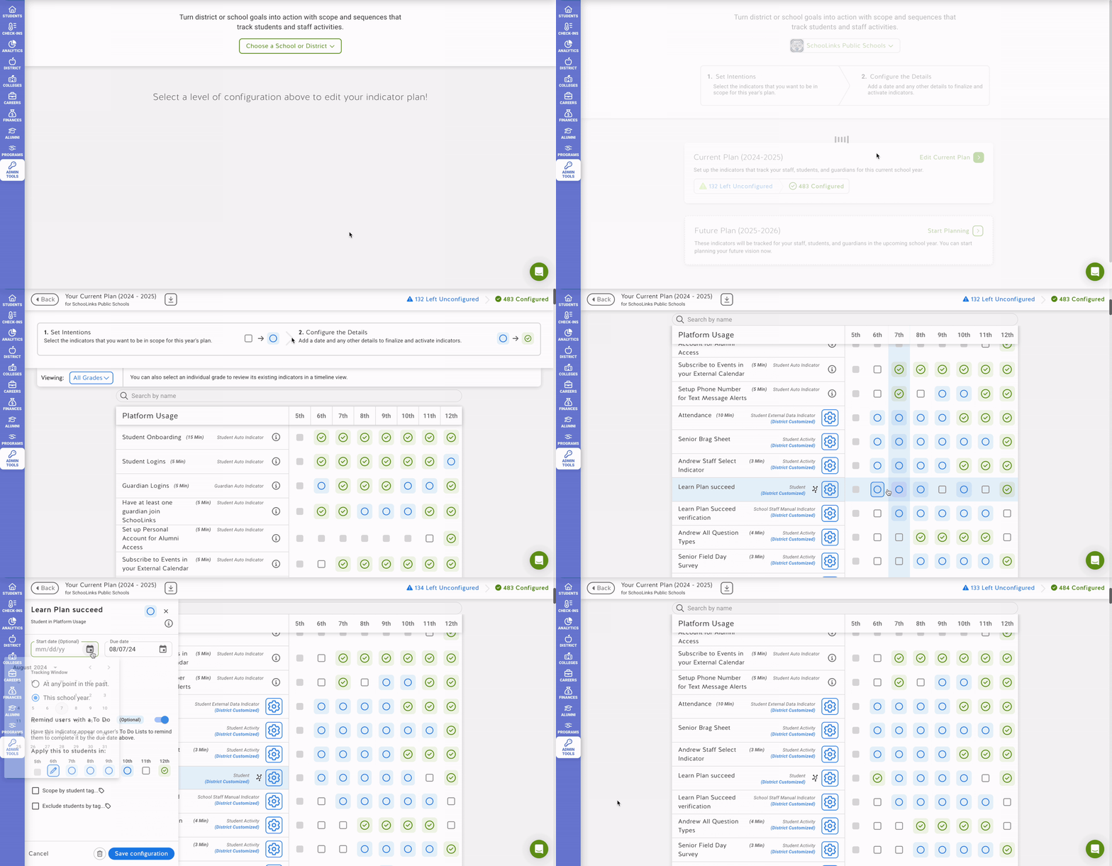
Let’s take a look at to-do configuration before
Because our customer success team spends a bulk of their time supporting districts in configuring student and staff to-dos during onboarding, the feedback they consistently receive through emails and on calls was a huge source of insight in initial research for this project. Users expressed both functionality that has been important as well limitations they would like to see improved.
Core functionality to maintain
Districts are able to add and configure to-dos at a district level, with flexibility for larger counts or earlier deadlines to be set by school. This allows districts to set a standard and gives each school a base “plan” to start with.
Users are able to “plan” for, or add, a to-do item before configuring its details, which makes the first step of configuring to-dos easier to digest. Districts also mentioned this workflow works well if they would like to collaborate with colleagues about what they want students to do at a high level. This also allows them to allocate different types of to-do’s to different staff users to configure if there are different areas of expertise.
Limitations and concerns to improve
Districts are only able to configure to-do by grades within a school. This makes it harder for districts to give multiple schools the same deadlines as this would have to be done by each individual school. Most importantly, this makes it difficult to support students with unique needs, like ESL students or SPED students.
Districts aren’t able to compare how to-dos are configured between schools. Beyond making the configuration process difficult, this also makes it difficult to support students due to the lack of transparency into which students are doing what.
Design solutions
After connecting with the customer success team and determining what we need to keep as well as what we need to improve, I had some initial ideas on what we can include in the design to improve this feature’s usability and better serve our districts. These ideas were to…
Structure to-do’s in “plans” that can be scoped to multiple schools and restricted by criteria like grades or tags. This would make configuration easier by allowing districts can combine schools into fewer plans, as well as better serve students with unique needs by supporting scoping beyond just schools. To supplement a district’s initial base plan, we can simply allow for duplicating plans instead.
Break up the plan creation flow to allow users to add to-do items to a plan before being able to configure each to-do. One major difference with how to feature was initially implemented was that even though users could “plan” to-to’s before they configure them, could also configure each to-do right away. There was a less clear workflow and no focused views. Since many districts like to “plan” to-dos first, we could just bake this into the workflow in a more focused way!
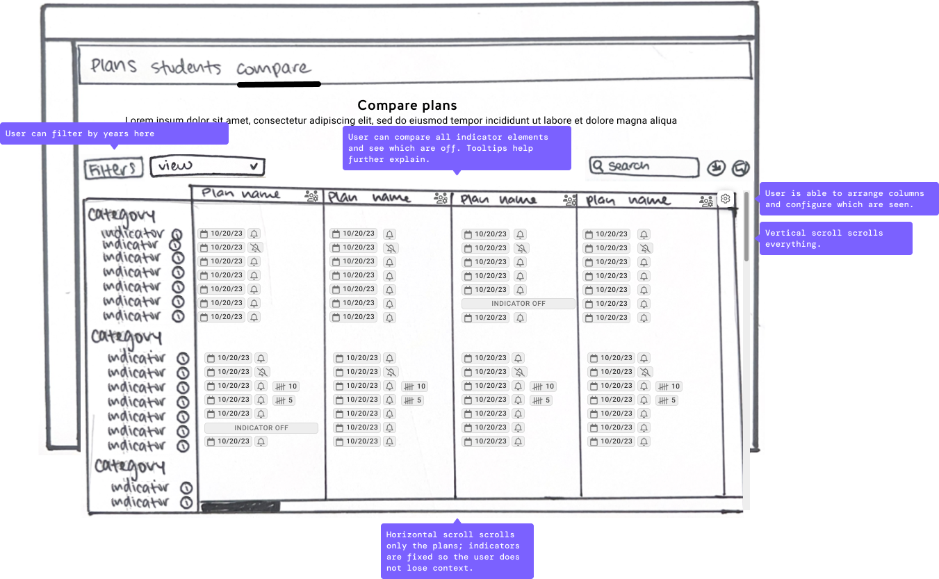
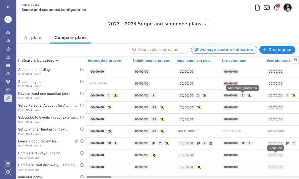
Introduce a compare view where staff users can easily see which to-dos are configured across plans, and how!
Low fidelity ideation
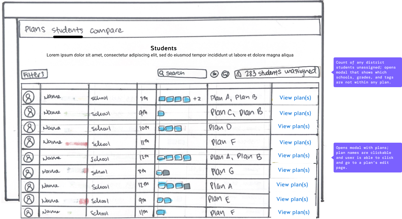
I started off low fidelity ideation by sketching some ideas in my tablet. Initially I had 3 tabs, a “plan” view where users can see plans by name and scope, a “students” view where users can view and compare which plans students have assigned to them, and a “compare” view where users can compare how to-do items are configured across different plans.
Revising the approach
After reviewing with the project manager, we determined that the student tab, while a nice addition, is less important to overall plan configuration and would be too much additional time and cost to build. We opted to instead show a warning if any group of students was not be included in a plan, which would then open a filtered list in our existing “student list” page.
Moving from low fidelity to high fidelity
Once I came to a solution that the project manager and I agreed is both user friendly and successfully meets our goals, I moved on to high fidelity where I continued to refine each screen.
Initial high-fidelity designs
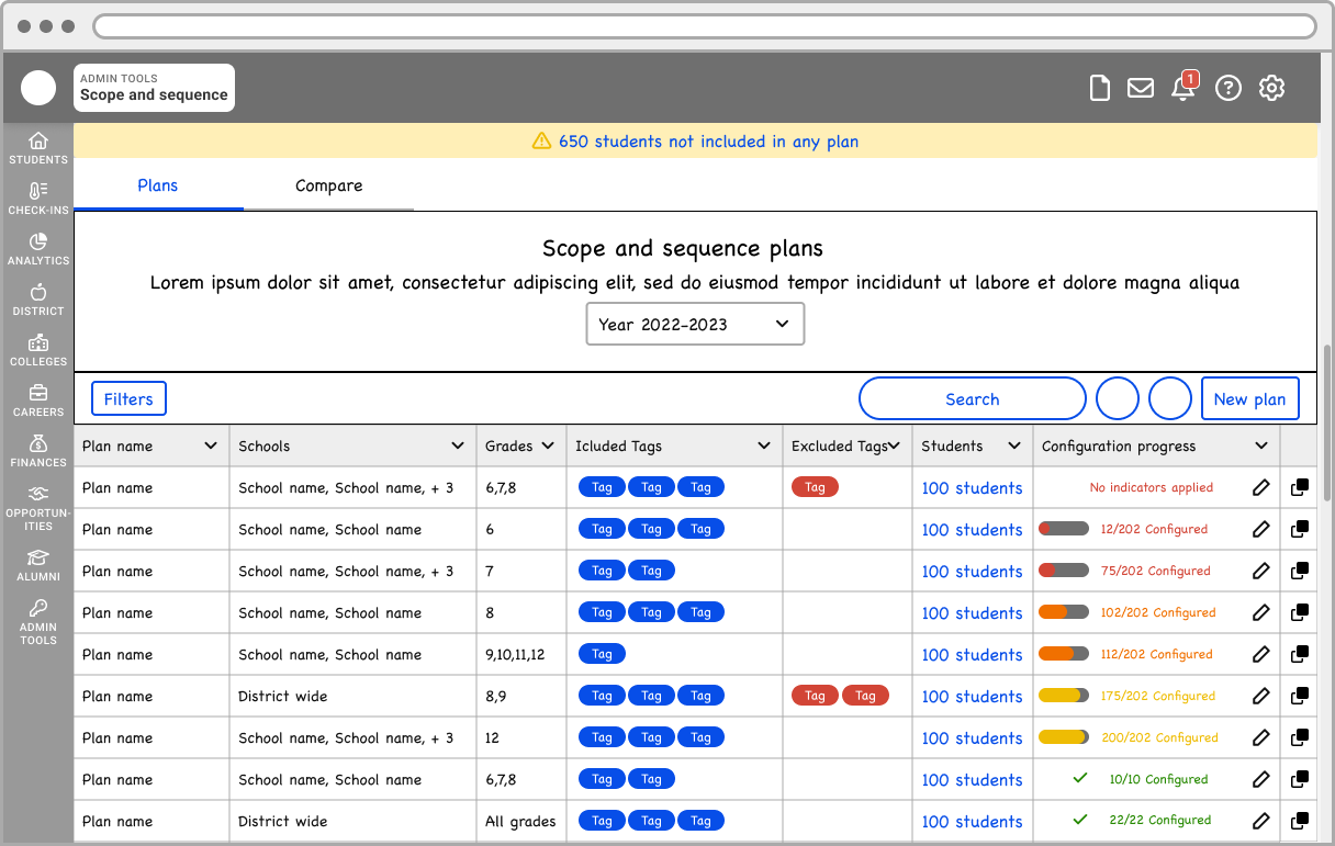
Landing page
On the plan tab, staff users could see all the plans they have created and how they are scoped. On the compare tab, they can see each to do item and how they configured between plans.
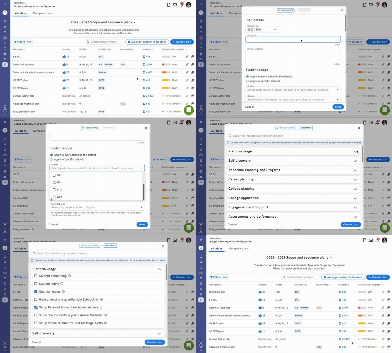
Creating a plan
When creating a plan, users start by adding details, assigning scope, and choosing the to-do items they would like to add. Once the plan is created, they have a plan with items added, but not yet configured.
Plan detail page
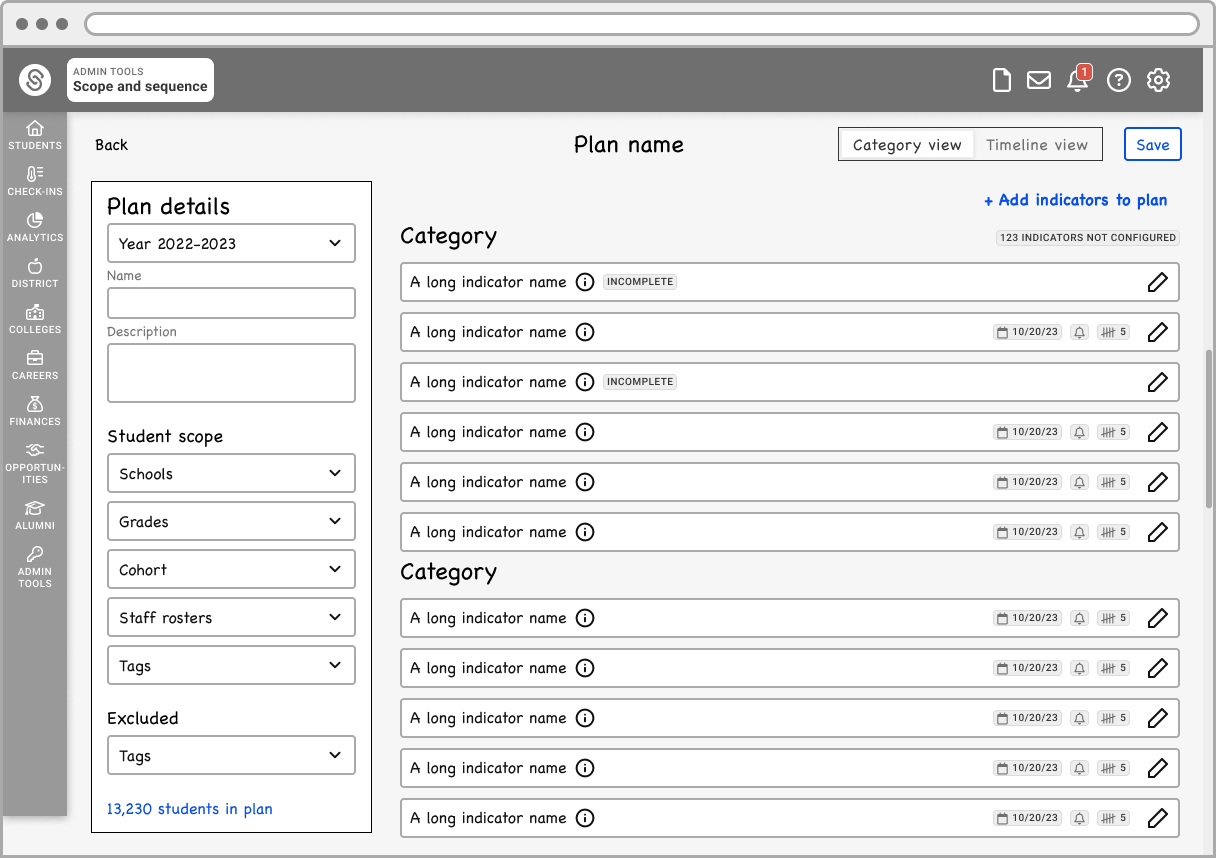
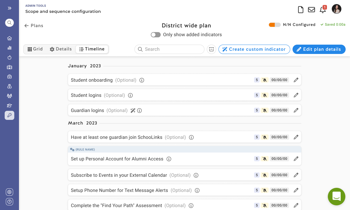
On the plan detail page, users can view to-do items by category in a list, or by timeline. Staff users can configure to-do items in a drawer as well as add additional items to their plan at any time.
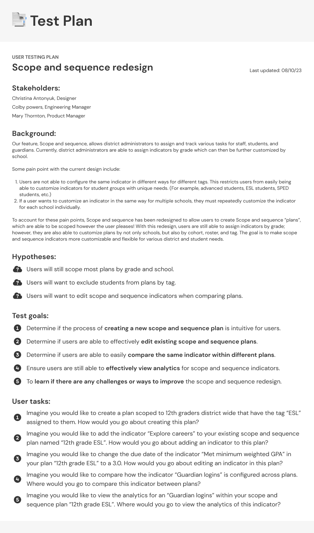
User test plan
When it comes to user testing, I always start by defining…
My hypotheses
Test goals
Key flows we want to test
User task scenarios for participants
Target users
Follow up questions for each task
I then send an email out to some of our users, expecting about 25%-50% to respond. Occasionally, I will test by sending out surveys or sending out simpler tests asynchronously. With this project, given the complexity of this feature, I scheduled live calls to guide users through the user tests.
Testing findings
All in all, our users LOVED this redesign! A feature that previously required support from the success team 100% of the time could now be done by users independently.
Users raved about…
Loving the streamlined workflow
Appreciating the focused view of only the to-dos they add
Finding it convenient to see configuration at a glance without having to open the drawer.
Users shared concerns that…
Not having a by-grade view may be challenging, since in many cases to-dos need to be configured differently by grade.
The plan scope feels a little distracting given that once it’s set, it likely won’t be edited.
Design revisions
Plan detail page revisions
The project manager and I decided that ultimately, it wouldn’t be difficult to incorporate a by-grade grid view to the plan detail page. To finalize this design, I incorporated a grid view and cleaned up the page a bit by hiding the plan’s scope in a modal where users can always review or edit if necessary.
Hand off to developers
After receiving overwhelming positive results and feedback during the testing as well as revising the designs according to our user’s needs, we had full confidence this feature was ready to implement!
Hand off to developers consists of a link to a Figma file where I’ll organize components, layouts, and user task flows in sections. I also use note components, arrows, and labels to add notes or describe interactions. This looks something like this 👇
Results
After supporting developers through development and performing design QA, this feature was ready to ship. Once implemented districts were able to create to-do plans more independently without needing support from the customer success team with each plan, cutting support time by 42%! The company was ultimately able to save a lot of time, and in turn money, by enabling users to configure this feature on their own.
With this update, district administrators much more excited to get our app set up with a less intimidating onboarding process!
Key contributions
Led the design process, overseeing the ideation, research, and testing of the solution.
Collaborated with the project manager in organizing project goals and timelines.
Advocated for usability and made sure our solution was user-centric
Client testimonial
“This is much simpler! I love how simple and focused each page is. This new design will make configuring {to-dos} much easier! I can’t wait to share this with the team.”
Counseler at a IL public school


