Student record matching
How I designed a feature that outperformed a competitor and increased revenue as a desirable add-on
Project overview
This project was done during my time working at an education software company where our app was focused on supporting college and career readiness. As part of a larger project where I designed a feature that allows third party users and alumni to request student records, I created a matching experience where staff users can easily match students in their data base to record requests. This feature would help instill goal-setting skills early on as a fundamental aspect of career readiness!
Role
I worked as the lead designer along side a product manager and our CTO for this project.
Duration
The design stage of this project took about 6 weeks from ideation to hand off.
Scope and constraints
This case study will focus on one task flow of an otherwise entirely new and complex feature. In designing this feature, I faced a time constraint from the customer as well as the limits of a design system.
Project goals
The main goals of this project were to…
Empower staff users to efficiently match record requests to alumni in the database in a way that reduces manual effort and streamlines the fulfillment process.
Improve the overall user experience for staff users by designing a modal that is intuitive, visually appealing, and provides clear guidance on how to match requests to records.
Increase accuracy by suggesting data-matched records, minimizing errors and enhancing accountability in record fulfillment.
Business goals
One of the primary business goals for this project was to outperform a competitor some of our customers had been using who offered a similar service for requesting student records. Because the competitor's service lacked a user-friendly interface and did not support districts in request fulfillment, we saw an opportunity for our app to become the preferred choice among districts. By designing a more intuitive and automated matching experience for external record requests, our aim was to surpass the competitor's offering and establish ourselves as the leading solution for record management among educational institutions.
Design process
My design process typically involves several key stages tailored to the project's scope, requirements, and budget. I begin with research to gather insights, after which I transition to ideating through iterative low-fidelity designs. These initial concepts are then reviewed collaboratively with the design team and project manager to ensure alignment on project goals. Upon approval, I move on to develop high-fidelity screens and user task flows, which are meticulously documented and handed off to developers for final implementation.
Research
As a first step, I conducted competitive analysis to evaluate similar services for requesting student records in the market. There was one main competitor our customers were using. I leveraged the insights gained from this research to identify opportunities to enhance our feature and address unmet needs in the market.
Low fidelity ideation
Following research, I created an initial lo-fi design. Most of this feature involved simply determining how to best organize a form as well as small editions to existing pages. My main challenge was to create a matching experience for record requests that did not meet every match criteria. I explored ways that we can show the completed form, suggested matches, and what the suggested matches were matched on.
Moving from low fidelity to high fidelity
Once I came to a solution that the project manager and I agreed is both user friendly and successfully meets business goals, I moved on to high fidelity where I continued to refine each screen. One major revision I made in high fidelity was allowing the user to add an alum to the database from this modal as well!
Final designs
In high fidelity, I finalized the visual design and refined the copy. I also spent a lot of time documenting layouts and laying out user task flows! While we’re focusing on just one aspect of the project here, the project as a whole required many screens between three user types as well as lots of edge cases to account for.
Final modal
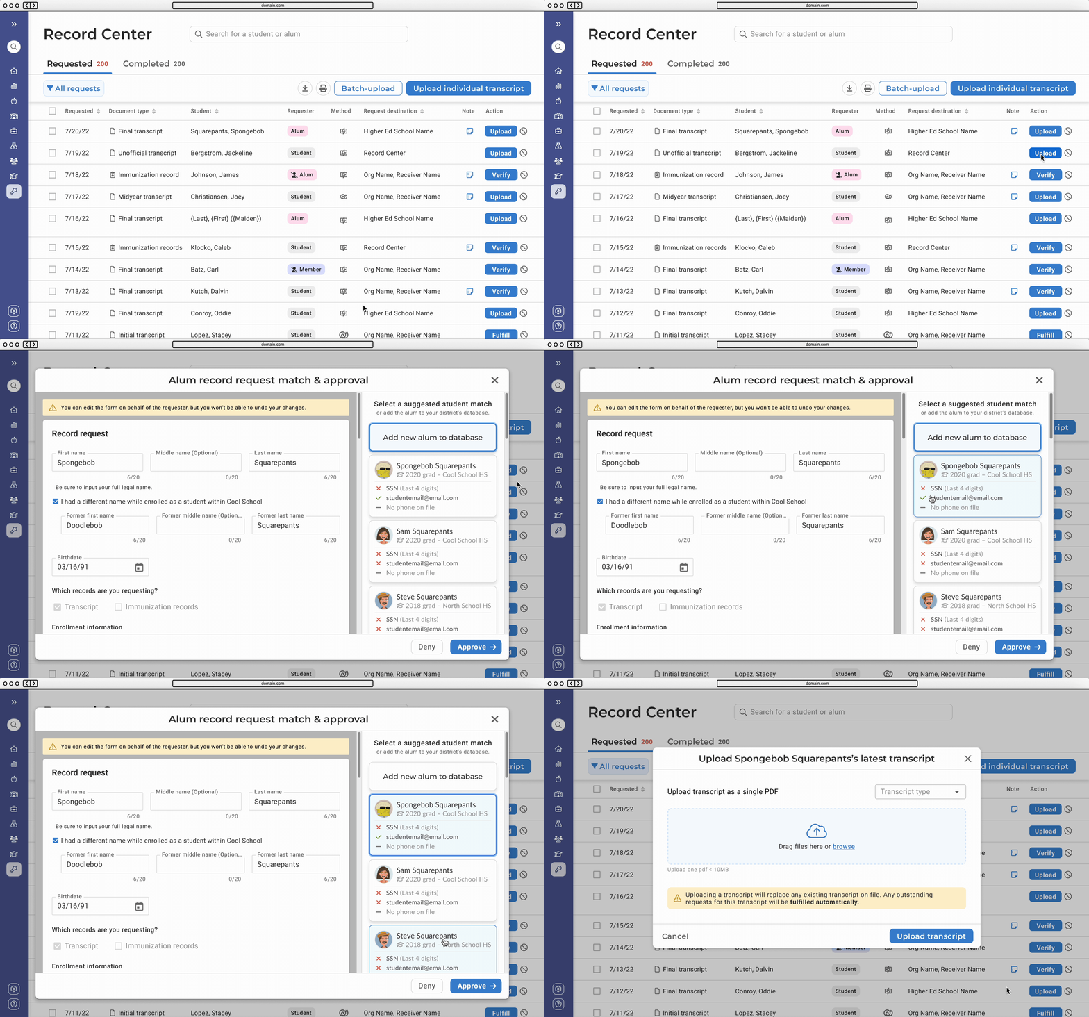
If a user clicks on “Fulfill” next to an external request on the record request page, the match modal is launched! Here the user can review the form, see suggested matches, or add the alum to the database.
Matching a request to a student task flow
Hand off to developers
Hand off to developers consists of a link to a Figma file where I’ll organize components, layouts, and user task flows in sections. I also use note components, arrows, and labels to add notes or describe interactions. This looks something like this 👇
Result
Once implemented, districts were able to invite alumni and third party users to request records through our new streamlined and intuitive feature. We were also able to extend previous transcript management services to include immunization records. With our innovative record matching modal, districts were supported in fulfilling *all* record requests, whether a total match or not. As more districts continue to use this feature, we will review sessions and continue to iterate on these enhancements to further improve our platform's functionality and user satisfaction.
Most notably, with this new feature our customers no longer needed to use a competing service in addition to our product. Instead, we were able to charge for this service as an add-on which proved invaluable to our customers given our more expansive offerings.
Key contributions
Led the design process, overseeing the creation of the entire solution from ideation to implementation.
Advocated for usability and made sure our solution was user-centric.
Streamlined project requirements with the product manager to ensure efficient implementation
Client testimonial
“This is so cool! We used to have to send records individually with {competitor}! This is amazing!”
Counseling Director at a NY public school


