Elementary goal setting
How I expanded our user base by over 100,000 after bringing college and career readiness to elementary students
Project overview
This project was done during my time working at an education software company where our app was focused on supporting college and career readiness. Alongside a broader initiative to expand our platform for K-5 students, I created a new feature that would allow students to create SMART goals. This feature would help instill goal-setting skills early on as a fundamental aspect of career readiness!
Role
I worked as the lead designer along side a product manager for this project.
Duration
The design stage of this project took about 8 weeks from ideation to hand off.
Scope and constraints
This was a complete new feature that was created as part of a larger initiative to expand our EL platform. Our main constraint was the inability to user test with minors or refer to any usage given our lack of existing elementary users.
Project goals
The main goals of this project were to…
Teach younger students goal-setting, contributing to our broader mission of preparing students for college and career success
Create a seamless and intuitive experience that makes the concept of goal setting less intimidating for students
Cater to the diverse needs of elementary students, supporting the developmental levels of both kindergarteners and fifth graders.
Business goals
As a college and career readiness platform, our target users are primarily students in grades 6-12. This, however, can limit our client base to exclude those with majority K-5 students. In combat, this feature was created as part of a broader initiative to extend the impact of our educational offerings to elementary students as well as our market reach.
Design process
My design process typically involves several key stages tailored to the project's scope, requirements, and budget. I begin with research to gather insights, after which I transition to ideating through iterative low-fidelity designs. These initial concepts are then reviewed collaboratively with the design team and project manager to ensure alignment on project goals. Upon approval, I move on to develop high-fidelity screens and user task flows, which are meticulously documented and handed off to developers for final implementation.
Research
In the research phase of this project, I encountered the challenge of not being able to directly engage with our primary users due to age restrictions and time constraints. We also did not have a current EL platform we could review engagement with, or any competitor with which I could perform competitor analysis. I resorted to conducting web research from which I gained valuable insight into the engagement preferences, cognitive development milestones, and parental involvement dynamics with K-5 students. Drawing upon my findings, I crafted user personas and an empathy map to inform my design decisions and ensuring a user-centered approach.
Considering UX principles
To further ensure well informed decisions, I also considered UX laws and principles that are especially relevant when designing for younger students:
The more choices a user has, the longer it will take them to pick one (Hick’s law) - Given the potential for shorter attention spans in children, minimizing the number of choices and providing clear, straightforward paths can ensure engagement and support decision-making.
The smaller and further away a target is, the harder it will be to acquire (Fitts’s law) - Recognizing that children may have less precise motor skills, designing larger interactive elements ensures easy navigation and a more accessible experience.
The average person can only keep about 7 items in their working memory (Miller’s law) - Considering the limited working memory of children, simplifying information and chunking tasks supports comprehension.
Low fidelity ideation
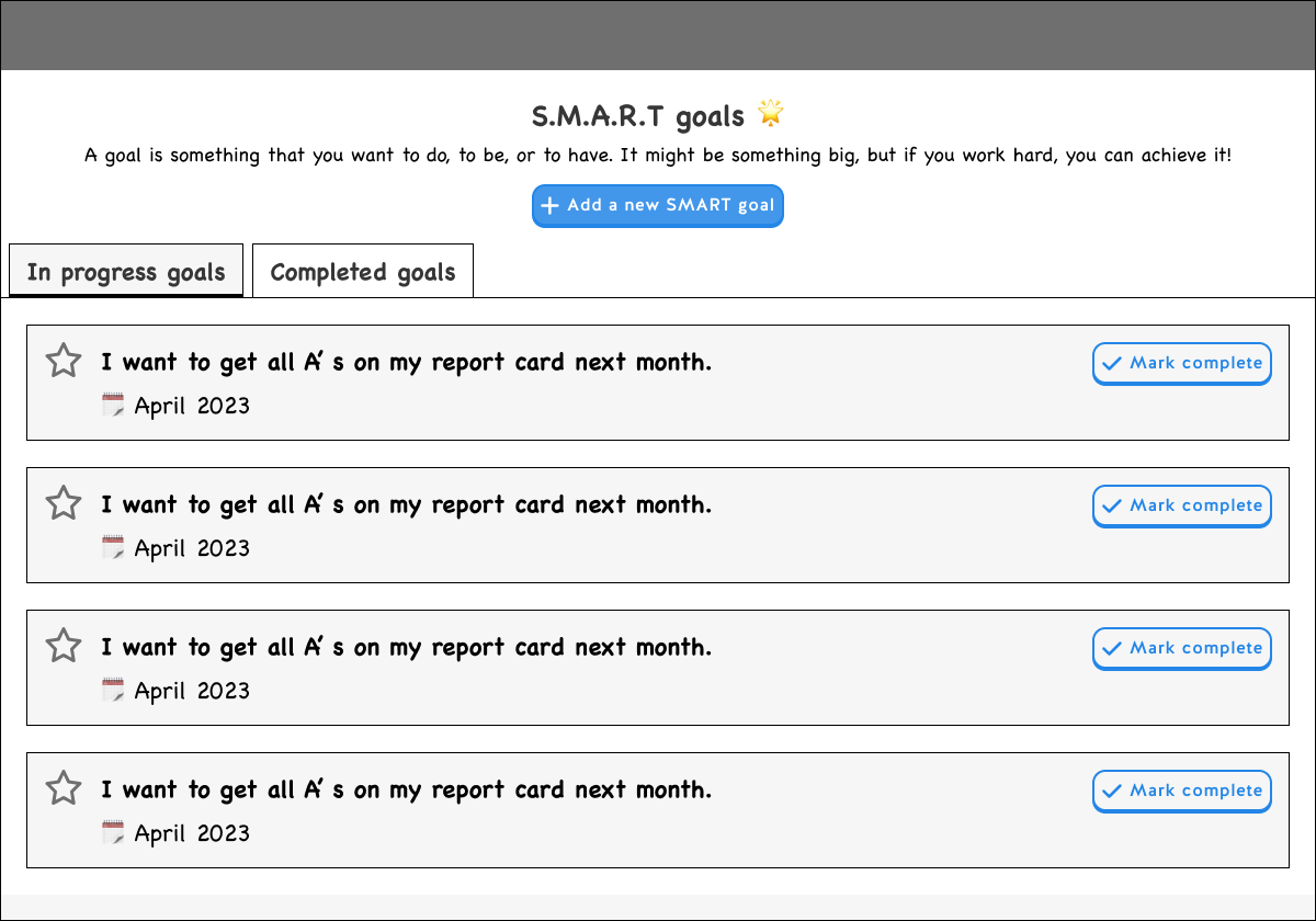
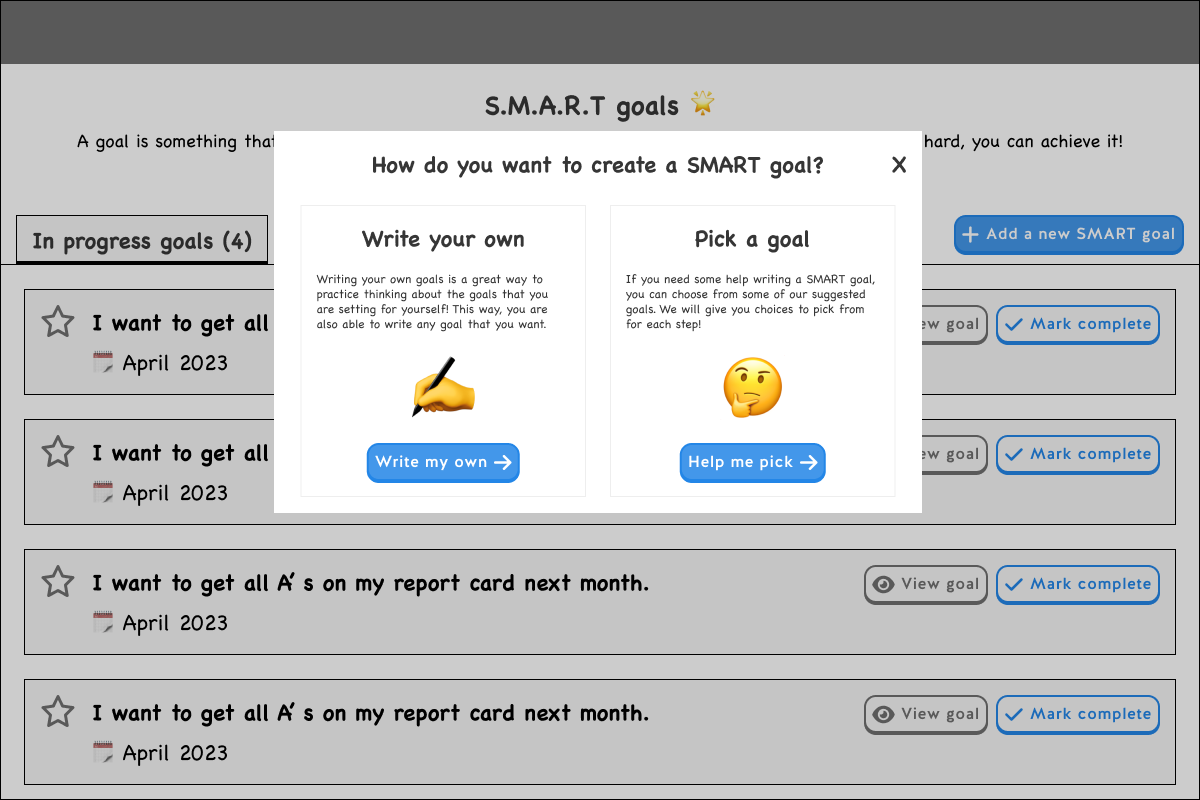
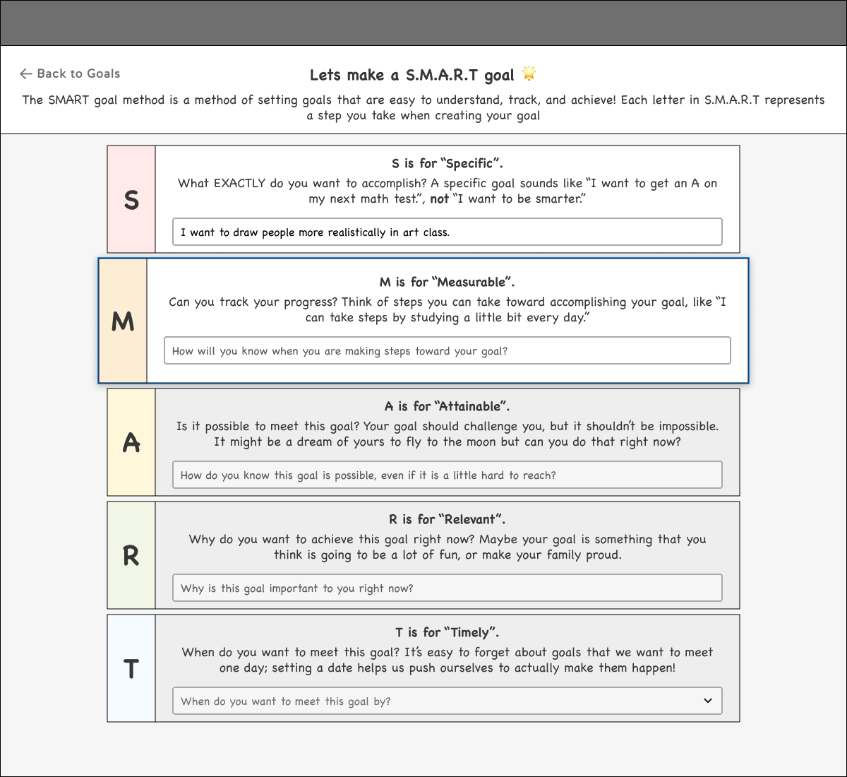
While exploring various ideas for this feature, it was a given that I needed to organize “In progress” and “Completed” SMART goals as well as chunk each step in the creation flow for easier comprehension. On top of organization, I also considered the idea of having various “long term” goals alongside SMART goals, though ultimately decided this complicates the feature.




Moving from low fidelity to high fidelity
Once I came to a solution that the project manager and I agreed is both user friendly and successfully meets business goals, I moved on to high fidelity where I continued to refine each screen. One major revision I made in high fidelity was simplifying the unselected states to reduce cognitive load and better focus the user on the active step!
Final designs
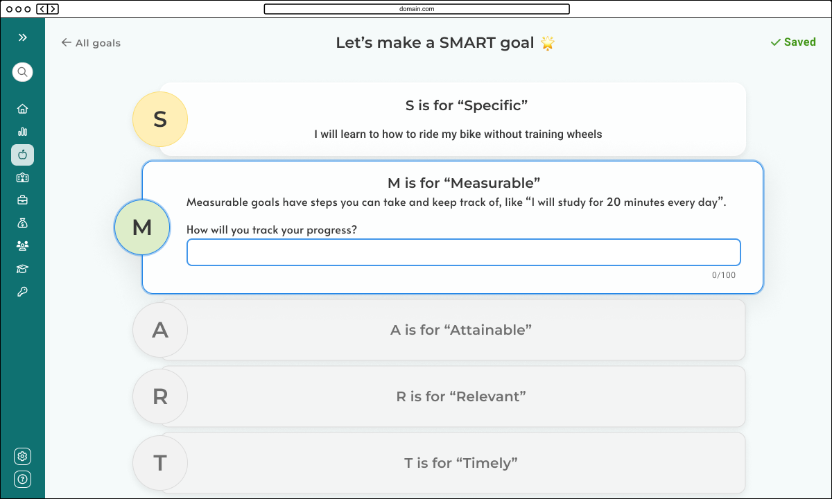
In high fidelity, I finalized the visual design, refined the copy, and ultimately created 2 experiences - a guided method with preset choices as well as a free response method. This would allow younger students to simply choose goals and older students to write their own!
Home page
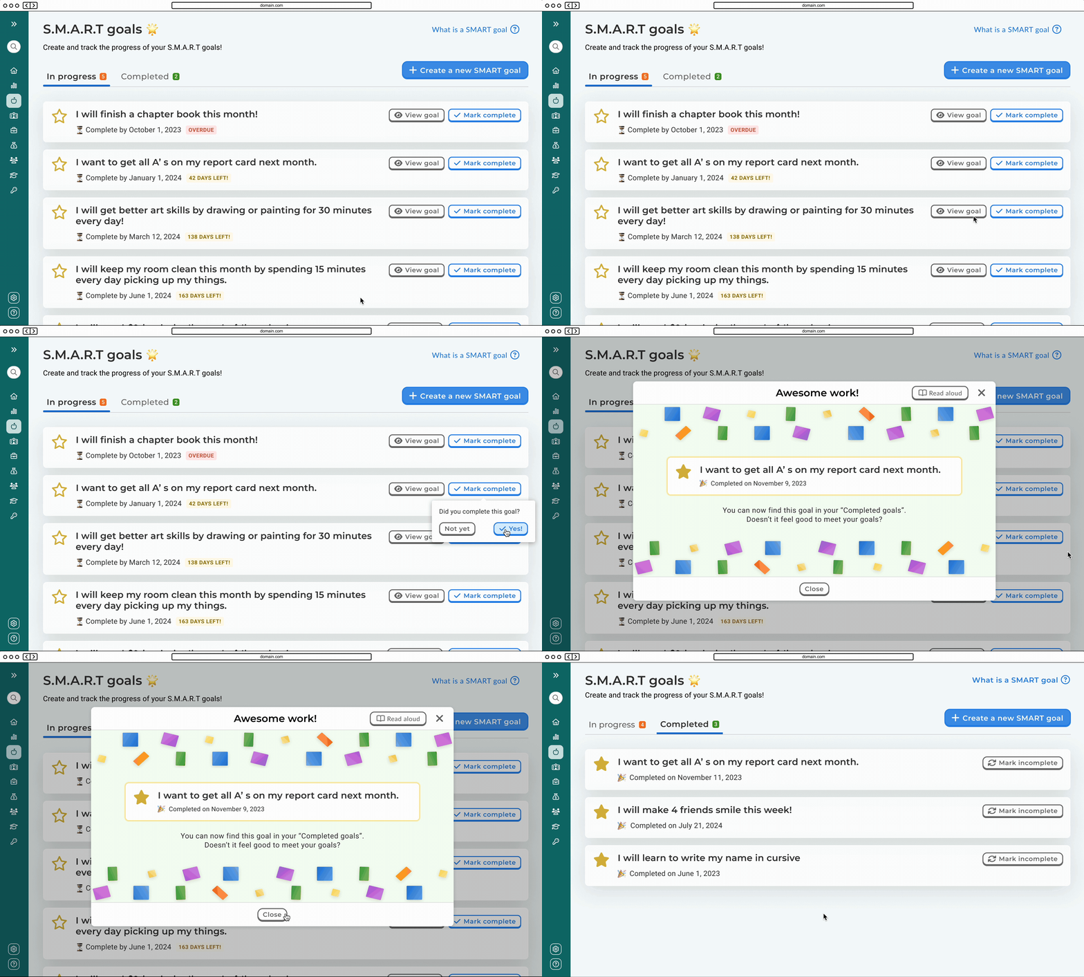
On the home page, the user can see all of their SMART goals and their progresses! On click of “Create a new SMART goal”, a modal is launched where the user can choose a method.
Edit page
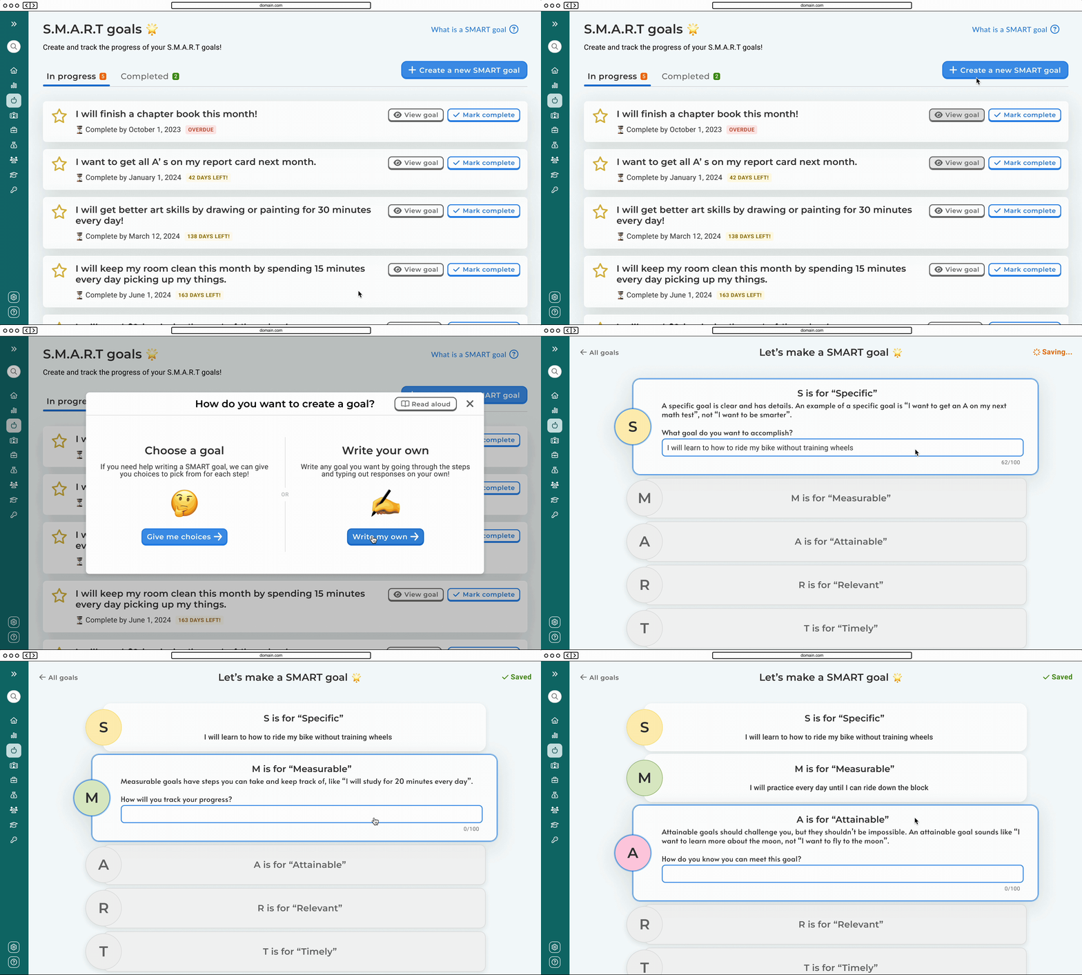
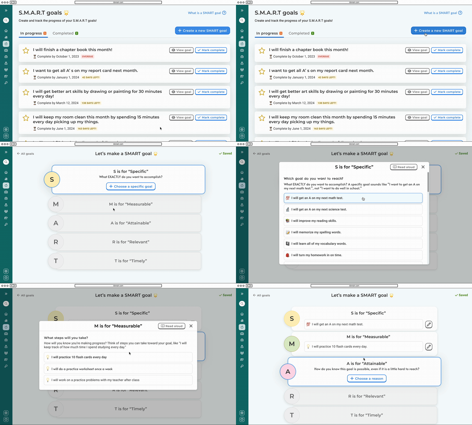
Depending on whether the user selects “Give me choices”, or “Write my own” from the SMART goals landing page, they will see one of two edit pages! In the guided method, users will be able to choose from a list of suggested responses for each step, whereas in the free response method users can create a unique goal with text inputs!
User task flows
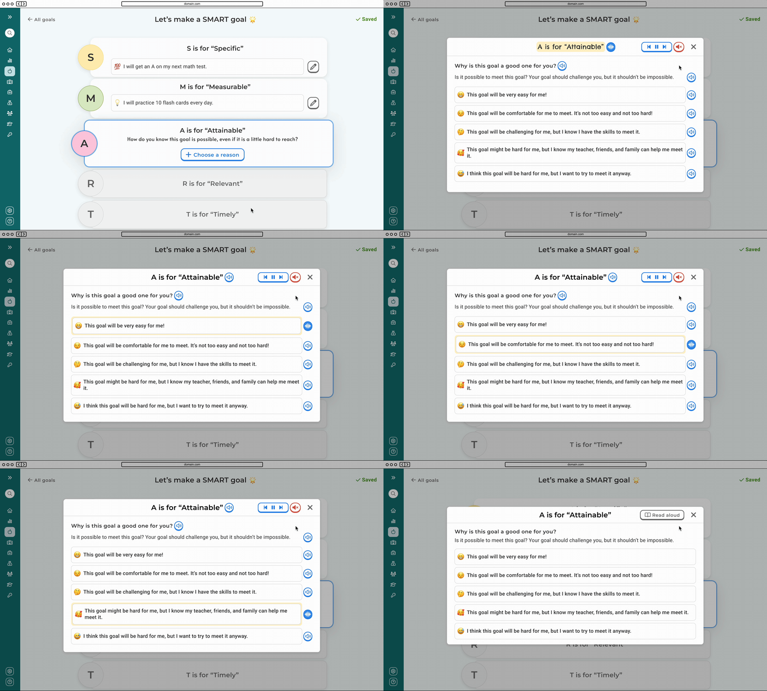
Alongside the high fidelity screens, I prototyped the key user task flows. Our EL features also include a read aloud function that students can leverage with this feature (which was another one of my design projects!) that is included in an example below.
Creating a written SMART goal
Creating a guided SMART goal
Using the read aloud function
Marking a goal complete
Hand off to developers
Hand off to developers consists of a link to a Figma file where I’ll organize components, layouts, and user task flows in sections. I also use note components, arrows, and labels to add notes or describe interactions. This looks something like this 👇
Result
The implementation of the SMART goals feature in our college and career readiness app was deemed a success by complimentary customers and eagerly engaged K-5 students! By providing a user-friendly interface and accommodating both preset options and free response prompts, I empowered young learners to set and monitor their goals effectively. Key stakeholders expressed high satisfaction with the feature, emphasizing its role in promoting student engagement and fostering learning on our platform.
Most notably, we scored a contract with a larger district that was eager to implement our app in their elementary schools, increasing our user base of over 100,000 between their students, staff, and guardians!
Key contributions
Led the design process for the SMART goals feature, overseeing the creation of the entire solution from ideation to implementation.
Advocated for usability and made sure our solution was user-centric.
Pioneered an adapted version of our design system to suit younger users.
Client testimonial
“We are so appreciative how interactive the platform is and how student-centered it is. I know this has been a long journey, and we are so appreciative. I am so excited to share more as we implement the program in elementary schools.”
District administrator at a VA public school


